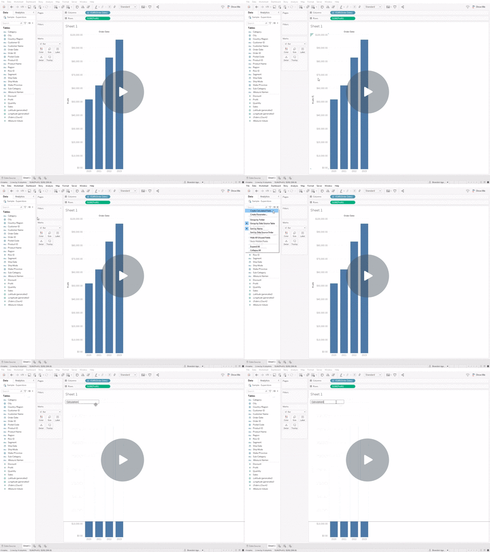
One of the (many) limitations Tableau has when it comes to applying colours to a chart is that the colour is applied to the data as a static colour. This doesn’t work well when you want to compare year over year data. Sure, you can apply a colour data that exists in 2023, but what happens when the calendar turns to to the next calendar year? There’s no data to apply a colour to.
This is where MAX and WINDOW_MAX comes in.
design.MaxYear
- Create Calculated Field
- Name the new calculated field (I like to use
design.MaxYearsince it allows me to quickly filter any new calculations that’s specific to design) - Copy and paste the following code – updating
[Order Date]to match your Date metric
IF max(year([Order Date]))=window_max(max(year([Order Date]))) THEN 1
ELSE 0
END- Convert your calculation from a Continuous to Discrete
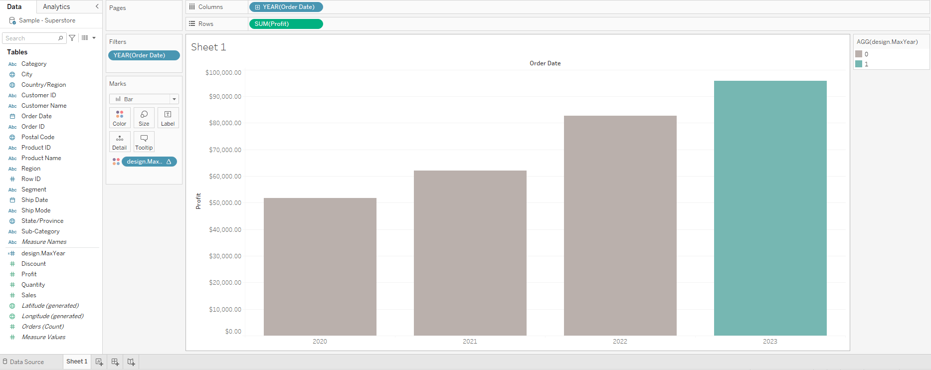
- Drag and drop the calculation to the Colour tab
- Apply the colours you want to the latest Year and the remaining years
You can watch the video here